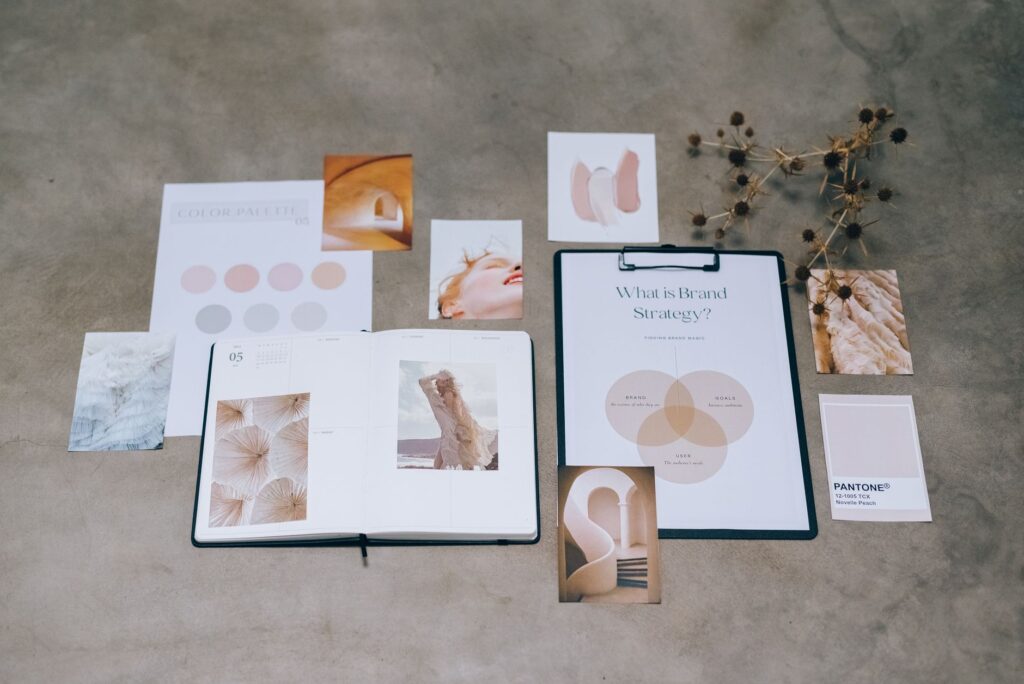
Your website colour scheme for small business is doing more work than you might realise. Colour affects how professional your business looks, how long visitors stay on your site, and whether they trust you enough to get in touch. Get it right and your design feels effortless and coherent. Get it wrong and something feels off — even to visitors who couldn’t tell you why.
Choosing a website colour scheme for small business isn’t about picking your favourite colours. It’s about understanding how colour communicates and using that to reinforce what you want people to feel when they land on your site. Here’s how to do it.
Why Colour Matters More Than Most Business Owners Think
Research into colour psychology consistently shows that colour influences perception before any content is read. Visitors form an initial impression of your website in under a second — and colour is the dominant factor in that first impression. Blue communicates trust and reliability, which is why it dominates financial services and healthcare. Green signals growth, health, and sustainability. Orange and red create urgency and energy. Black conveys premium quality and authority. Soft neutrals suggest calm and approachability.
None of these associations are absolute rules — context and combination matter enormously. But understanding the emotional language of colour helps you make deliberate choices rather than accidental ones.
Start with Your Brand, Not a Trend
The most common mistake small businesses make with website colour is choosing whatever looks fashionable right now rather than what aligns with their brand identity. Trendy colour palettes date quickly and can make a site feel inconsistent with a brand’s longer-term positioning.
Start with three questions: What do you want clients to feel when they arrive on your site? What colours are already present in your logo or brand materials? What colours do your strongest competitors use — and do you want to align with or differentiate from them?
If you already have a strong logo with defined brand colours, your website palette should be built around those colours, not chosen independently. Consistency between your logo, your website, and your other marketing materials is what creates a recognisable brand rather than a collection of unrelated design choices.
The 60-30-10 Rule
This is the most practical framework for building a website colour scheme that works. It’s borrowed from interior design but applies perfectly to web design:
- 60% — your dominant colour: This is your background colour. For most websites, this is white, off-white, or a very light neutral. It creates breathing room and makes your content easy to read.
- 30% — your secondary colour: This is your brand’s primary colour — used for headers, navigation, section backgrounds, and other structural elements. This is where your brand’s personality shows up.
- 10% — your accent colour: This is your call-to-action colour — buttons, links, highlights. It should contrast clearly with both your dominant and secondary colours to draw the eye where you want it.
Most websites that feel visually overwhelming have ignored this ratio — they’ve used their brand colour at 60% (too intense) or used five different accent colours (too scattered). Constraint is the foundation of good colour design.
Choosing Colours That Work Together
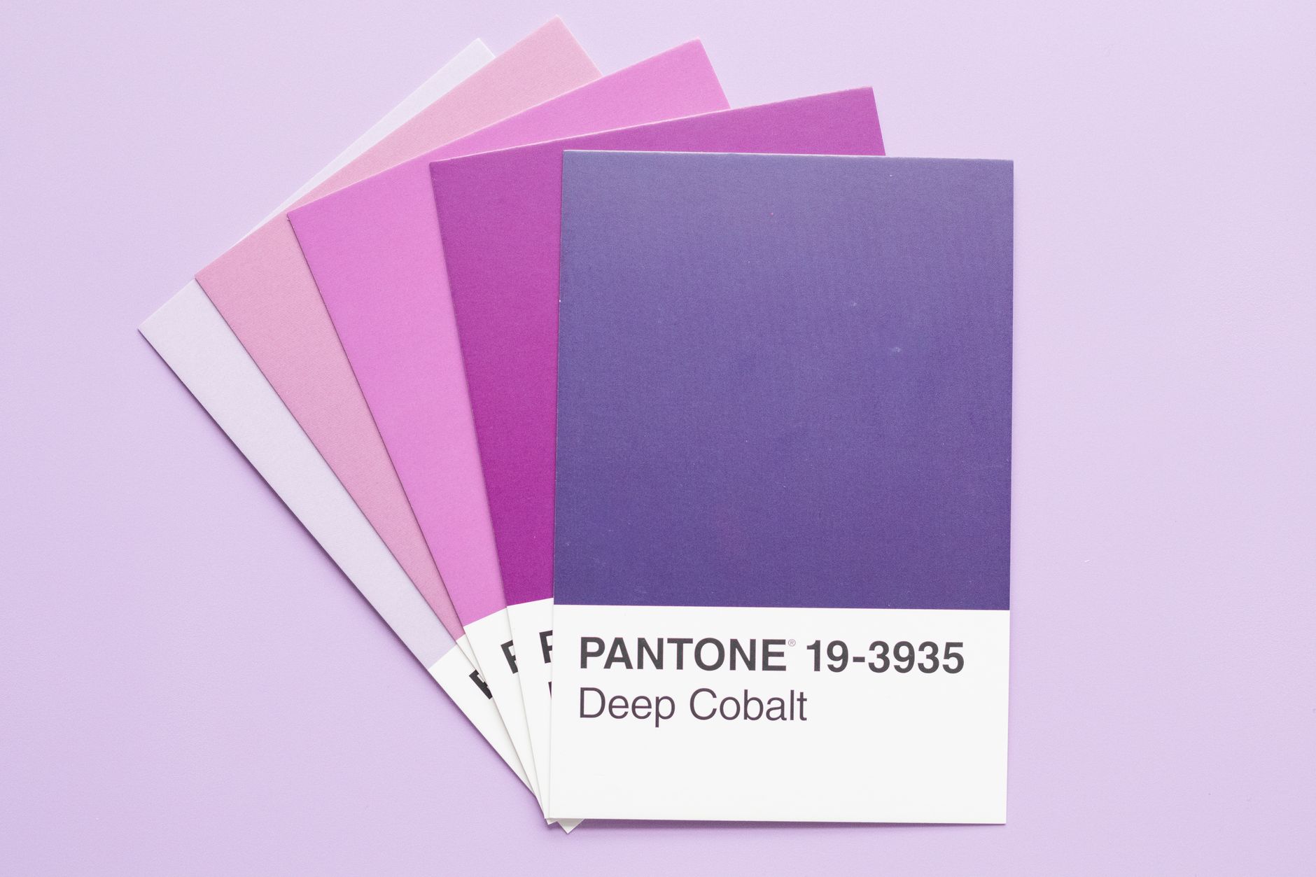
You don’t need to be a designer to build a harmonious colour palette. These approaches reliably produce combinations that work:
Analogous colours
Colours that sit next to each other on the colour wheel — blue, blue-green, green — create a harmonious, calm feel. Good for wellness, creative, and professional service businesses. The risk is that they can feel low-contrast and flat if not handled carefully.
Complementary colours
Colours opposite each other on the wheel — blue and orange, purple and yellow — create high contrast and visual energy. Used carefully (usually as primary and accent rather than at equal weight), they’re eye-catching and memorable. Used carelessly, they’re jarring.
Neutral-led palettes
White, grey, black, and beige as the dominant palette with one strong brand colour as the accent. This approach is clean, timeless, and works for almost any industry. It’s the safest choice for businesses that want to look professional without taking significant design risks.
Accessibility: The Part Most Websites Get Wrong
A colour scheme that looks beautiful but fails accessibility standards is a colour scheme that’s excluding a portion of your visitors — and hurting your SEO in the process. Google factors page accessibility into its quality assessments, and poor colour contrast is one of the most common accessibility failures on small business websites.
The WCAG standard requires a contrast ratio of at least 4.5:1 between your text colour and background colour. Dark grey text on a white background passes easily. Light grey text on a white background often fails. Pale yellow text on a white background almost always fails.
Use the free WebAIM Contrast Checker (webaim.org/resources/contrastchecker) to test your text and background colour combinations before you commit to them. This takes five minutes and can save you from a design choice that’s quietly pushing visitors away.
Practical Colour Recommendations by Business Type
If you’re starting from scratch, here are colour directions that tend to work well for common small business types:
- Professional services (accountants, consultants, lawyers): Navy or dark blue primary, white dominant, gold or slate accent. Communicates trust, competence, and authority.
- Health and wellness: Sage green or soft teal primary, warm white dominant, muted gold accent. Communicates calm, natural, and nurturing.
- Creative agencies and design studios: Strong brand colour (can be almost anything) at 30%, white or near-white at 60%, black or dark grey accent. Clean, confident, modern.
- Trades businesses: Deep blue or charcoal primary, white dominant, orange or yellow accent. Communicates reliability and action.
- Food and hospitality: Warm tones — terracotta, warm white, deep green or burgundy. Communicates warmth, quality, and appetite.
Where to Find Colour Palette Inspiration
Three free tools that consistently produce professional results: Coolors (coolors.co) generates harmonious palettes and lets you lock colours you like while regenerating the rest. Adobe Colour (color.adobe.com) lets you explore colour rules (analogous, complementary, triadic) and adjust to find combinations that work. Muzli Colors shows real-world website applications of colour palettes, which is far more useful than looking at colour swatches in isolation.
At Aesthetic Web Studio, colour strategy is part of every website project we take on. We don’t just pick colours that look nice — we choose combinations that communicate the right things about your business to the right audience. Get in touch to talk about your project, or read our guide on what makes a good website for more on the elements that matter most.
Frequently Asked Questions
How many colours should a small business website use?
Three to four is the sweet spot: a dominant background colour, a primary brand colour, an accent colour for CTAs, and optionally one additional neutral for text or borders. More than four colours without a strong design rationale usually results in a cluttered, inconsistent look.
Should my website colours match my logo?
Yes — your website palette should be built around your logo colours, not chosen independently. Consistency between your logo and your website creates a coherent brand identity. If your logo colours don’t work well on a website (some logo colours are too intense for large background use), work with a designer to develop a web-appropriate palette derived from your brand colours.
Can I change my website colour scheme without a full redesign?
Often yes. On WordPress, global colour changes can usually be made through the theme customiser or by editing CSS variables — updating a handful of values can change the entire site’s colour scheme in minutes. Whether this works cleanly depends on how your theme was built.
If this was useful, tell Google you want more of it.